Components are all external elements which are integrated into a document, e.g. teaser images. In contrast to the component structure where only the components' document IDs are shown, you can find some basic information about them on the components tab. You can also integrate components directly into the copytext; you can find more informations about that here. You can create components easily using drag and drop, as well as in the component structure's context menu.
Component Structure
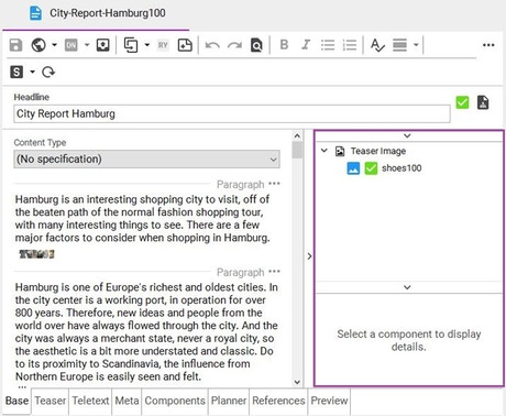
The component structure is embedded in the document editor. Once you are on a form tab, it will be shown on the right side of the editor. If you are on the components tab, the right side will contain only the component details; the structure will then be on the left.
In the component structure, you will find all documents which are attached to the document opened in the editor. Just the IDs of the referenced documents will be shown. You can move these documents into different component groups and change a component's content for this very reference, if necessary.
Adding Components
You may add components in two different ways.
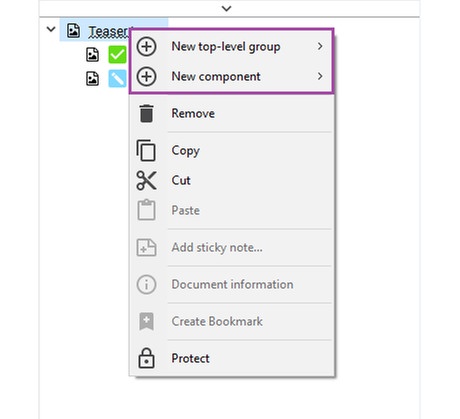
Right-click into the component structure. In the context menu, choose New Top-Level Group and select the group you wish to add. If the group to which you like to add components to already exists, right-click onto this group and select New Component. If there are opened documents which would fit into this group, they will be offered to you directly in the menu. Below, you have the possibility to create new documents; they will be added automatically after their creation. You may also add a document from the clipboard by using the button Paste from the group's context menu.
There is also the possibility to drag and drop a document into the component structure, e.g. from the search view. A new component group will then be created automatically. If there is more than one type of group to which the specific document type could be added, you will be asked to choose one of them. If you wish to add the document to an existing group, just drop the document into that group.
Components-Tab
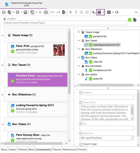
You can keep track of the components of a document on the Components tab. Here, more space and a selection out of three different display modes is available. You can change the display modes with the according button in the editor toolbar or by using the shortcut Ctrl + D. Doubleclicking on a component will open the according original document. You can receive further information about a component using Right-click >> Open Component Details.
Full
In display mode Full you can see a short summary of the components' content. Thus, you will see a component's teaser image, its document status, its title and sophora ID and some informations about its last editing.
If you click on a component, you can gain more information about it in the component details on the right side.
Compact
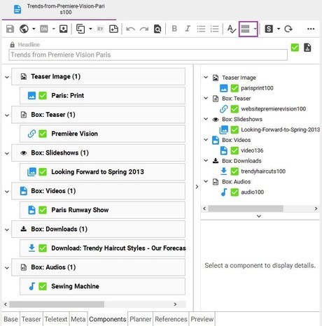
In display mode Compact, you can receive an overview about a document's components in the easiest way. You will just see a components title and the document status and type icons.
You can look at a component's details by clicking on it, analogously to the full display mode.
Tiles
In this display mode, the components are shown as tiles. The component details are shown directly on those tiles. Thus, you can overwrite them in a simple manner.
By default, the component details on the right will be collapsed.
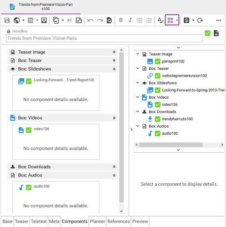
Component Details
You can use the compontent details to change the appearance of a referenced document. This will not change the component's content. For this usage, some component details may be overwritten. You use this feature, if an embedded document comes along with inappropriate content (i.e. the caption of an image doesn't fit in the context of the document the image is attached to).
To replace certain information of a component, proceed as follows:
- Select the desired component in the component structure.
- The component's replaceable content will appear in the Component Details. All fields within the component details are initially filled with the component's original content in grey letters and are not editable.
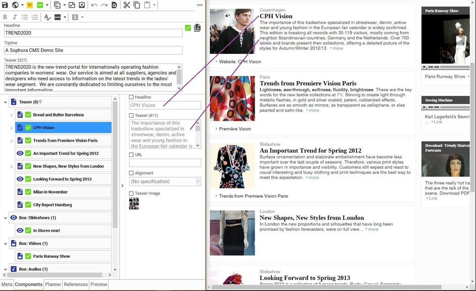
- To overwrite a field, e.g. the headline, enable the according checkbox. Subsequently, you may edit the field and enter the new content.
- To revert an overwritten field, just disable the respective checkbox again.
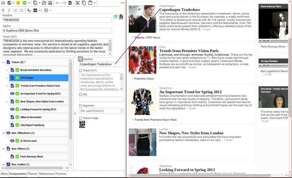
The original headline from the overwritten document still appears in every other document including it, as well as in the document itself.
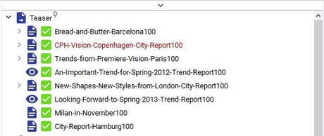
All overwritten documents will be marked red in the component structure.
Overwriting Components of Referenced Documents
If the components of referenced documents also appear in the website of your document, e.g. if the list of links of referenced documents appear in the teaser list on the website of the homepage, you may want to change these components for this reference only.
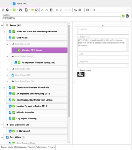
The following example shows the homepage document home100 that references the document CPH-Vision-Copenhagen-City-Report100 which also contains component groups containing components, e.g. the link document cphvisionsite100. These component groups and components are marked grey since they are displayed like they are referenced in CPH-Vision-Copenhagen-City-Report100 and cannot be modified in this place. The Component Details show the editable fields of the link document cphvisionsite100, e.g. the headline and the teaser text.
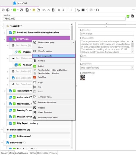
To alter the components of a referenced document like CPH-Vision-Copenhagen-City-Report100 for this reference only, open the context menu of the referenced document and select Edit Components. The components of the referenced document (CPH-Vision-Copenhagen-City-Report100) will then be copied into the referencing document (home100).
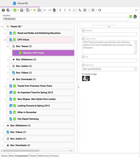
From now on, the components of the referenced document (CPH-Vision-Copenhagen-City-Report100) are totally uncoupled for that reference in the referencing document (home100); i.e. changes to the components in CPH-Vision-Copenhagen-City-Report100 have no effects to that reference in home100 and vice versa. The components of the referenced document (CPH-Vision-Copenhagen-City-Report100) are marked black in the component structure now and can be overwritten as usual, e.g. the headline of cphvisionsite100. Moreover, new component groups and components can be added and existing component groups and components can be removed. The order also may be changed.
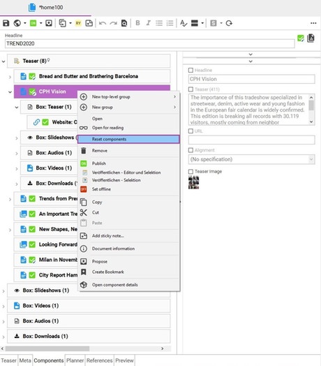
To revert all changes and to use the components of the referenced document (CPH-Vision-Copenhagen-City-Report100) as is again, open the context menu of the referenced document and select Reset Components. Its component groups and components will be marked gray again and therefore cannot be changed in that place. Changes in the referenced document (CPH-Vision-Copenhagen-City-Report100) appear in the referencing document (home100).
Hierarchy Groups
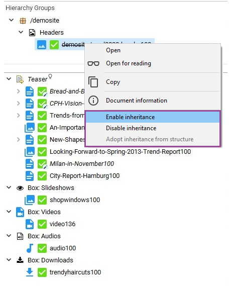
The component structure view also shows the components of all section documents in the structure path of the opened document. Typically, these components are displayed in the document's web page, e.g. as boxes in the right column. Individual components can be included/excluded from this inheritance by their context menu.
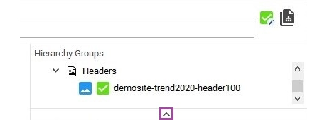
By default, the hierarchy groups will be displayed collapsed in the component structure. If you wish to see them, just click an the arrow above to expand the view.
Time Scheduling of a Document's Components
On the time scheduling tab of the document editor you can see whether the components of a document are scheduled to be published. For example, you can control in which time frame the teaser of a site will be shown on the website. You can also define multiple publication periods for one component.
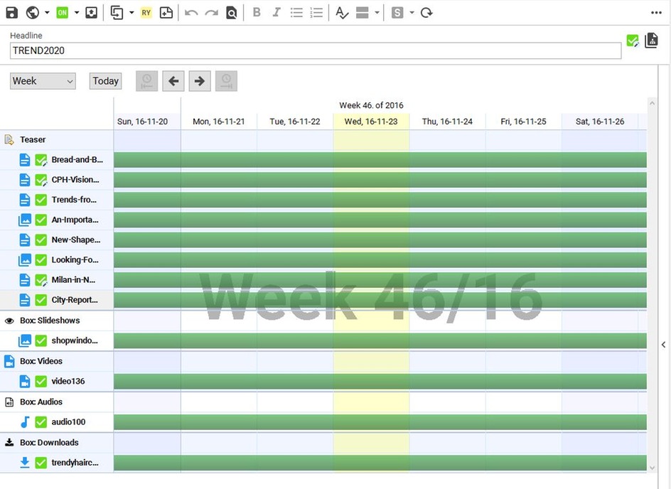
In the time scheduling view, you may...
a.) ... open the dialog for editing the timing by double-clicking the timeline. Note, that you may enter multiple time periods
b.) ... add new time periods. Press Ctrl, so the plus icon will appear, and click into a free area of a timeline
c.) ... remove time periods. Press Ctrl, so the pair of scissors appears and click on the moment until which you wish to prevent the component's playout.
d.) ... prolong or foreshorten a time period. Press and hold Ctrl, pick a timeline at its beginning or end and move it.
When editing time periods you may define the start and end date. Either may be empty for an infinite start/end. Besides (multiple) fixed time blocks it is also possible to create repeating time periods (periodic time schedule). Select the days of the week at which the component should be available and define a duration. At each selected day of a week the component will be available at the time of the start date for the given duration until the end date is reached (if set).
You can switch the display mode of the timeline; you may pick one out of "Month", "Week", "Three days" or "Day". If you press and hold the left mouse button onto the timeline, you can scroll it. Alternatively, you can also click the right or left arrow in the timeline to scroll to the previous or next period automatically; you may also do that with your mouse wheel while pressing Shift.
Colours of the Timelines
- Light Green: Neither the component nor the referenced document defines a scheduling. (1)
- Dark Green: The component is not subject to a time scheduling, but the original document is. (2) When the component will not be played out because of its own time scheduling, the timeline will be hatched (3).
- Light/Dark Blue: The reference is subject to time scheduling. (4, 5)

Protection of Components
Component groups of a document can be protected via the component structure. This can be done for all top-level groups and its subgroups. Protected groups can not be edited via the component details. Also, you cannot add or remove components or component groups to/from a protected component group.
You can protect component groups by using the context menu. The removal of the protection can also be done via the context menu.
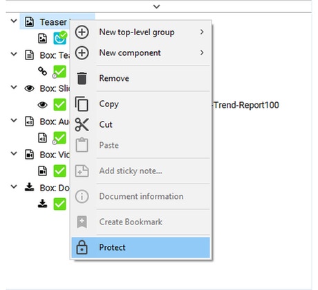
You can recognize protected groups by the lock icon.
